I wanted to write some thoughts about CSS, so here they are.
CSS (Cascading Style Sheets) first came to be around 1996 as a way to style web pages (HTML). Back in high school, I learned about HTML but I don’t recall learning about CSS. Nowadays, CSS seems to be where you put all of the styling for a website, leaving the HTML file with only content (written text, meta information, images). Even images can be added to a web page using CSS. It makes sense that content and UI are separated so that people in different roles don’t need to worry so much about others’ roles, i.e. the design team contracted to code the style for a website are mainly just required to set up a site, then the site manager can add content using HTML or a site builder.
By doing freecodecamp’s responsive web design course, I have been learning how to use CSS. At the moment, I find it a bit confusing how there seem to be several ways to achieve similar outputs, e.g. flex, grid, margins, borders, gaps, hsl, rgb, queries, wrappers, etc. I would like to wean myself away from following tutorials and try to create my own sites. One step at a time I suppose.
During my cert 3 in IT, I was tasked to create websites for businesses. I had to create a simple gallery to show the images. That’s when my friend told me about flexbox 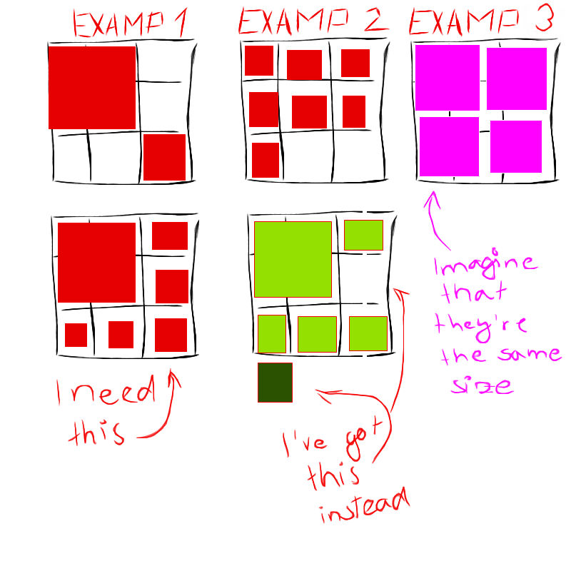 .
.
Basically, flexbox is a CSS property that lets you move elements on a webpage responsively (meaning they can move based on the screen dimensions). It allows these elements to talk to each other and spread themselves out. This is ideal for, say, an image gallery or a navigation bar. Flexbox’s counterpart is grid, which lets you easily set defined areas for your page that your content must conform to. 
For anyone else who is new out there to web design, make sure you learn how these properties work (check out the links above) and test them out when creating your own pages.